Sample report · a walkthrough
This is what you get. Here's how to read it.
A real report on Grab, as it was delivered on 18 September 2026. 5 stops, about two minutes. Nothing here is mocked up; every number and quote is from the report.
The whole conversation, in one sentence
The first thing you see is the finding, not a dashboard.
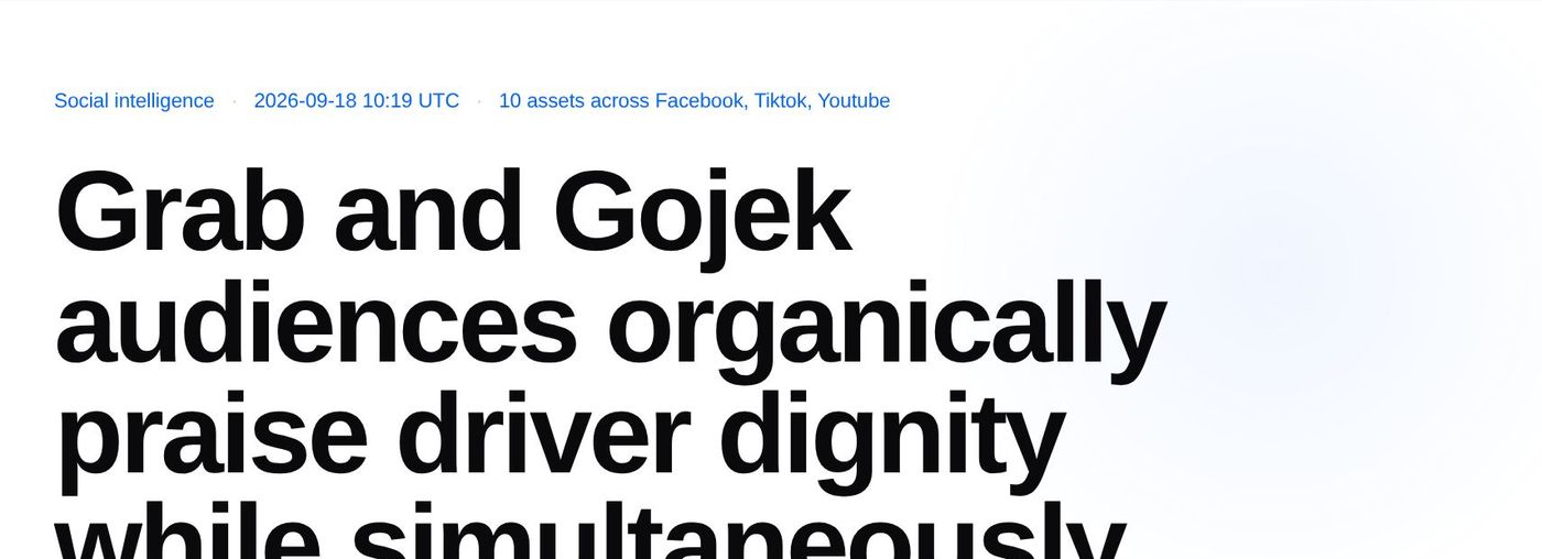
- aWhen it ran and what it read: 10 public posts across Facebook, TikTok and YouTube.
- bThe headline is written from the comments, not from a brief. Here: people praise Grab and Gojek drivers, and in the same breath document abuse, exploitation and racial profiling.
How much was read, and which way it leans
Five numbers that tell you whether to trust what follows.
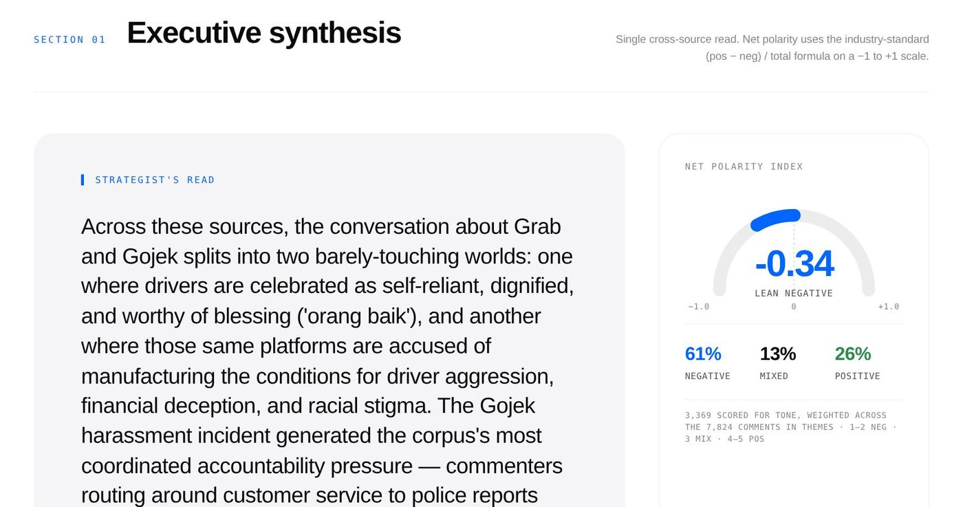
- aAll 10,382 comments were read and sorted into themes, about 86 hours of work by hand. 3,369 of them, a sample from every theme, were also scored for tone.
- bLean negative, at −0.34 on a scale from −1 to +1. The posts themselves were neutral (+0.05); the audience was not.

A paragraph you can lift into your deck
What a strategist would tell you after reading every comment.
- aThe strategist's read: two worlds that barely touch, drivers celebrated as dignified and platforms accused of creating the conditions for abuse.
- bThe tone in one gauge: 61% negative, 13% mixed, 26% positive.
How tone is worked out
- Read the post first. Each post is summarised before its comments are touched: what it's about, who it's for, its own tone. “That was insane” means one thing under a crash video and another under a product review.
- Judge each comment in words. Each comment gets a short written judgment of where it stands, in context and in its own language, including sarcasm and in-jokes. No score yet.
- Match it to a fixed scale. That judgment is matched to the closest of five fixed descriptions, from strongly negative (1) to strongly positive (5). The same five descriptions are used on every report, so the model never makes up a number.
- Net it out. Tone is the share of positive comments (4–5) minus the share of negative ones (1–2), from −1 to +1. Here: 26% positive minus 61% negative, about −0.34.
Only tone uses a sample. The themes and their sizes come from all 10,382 comments. Tone is scored on a sample from every theme: all of a theme's comments when it has 30 or fewer, and up to 95 from the biggest. That's enough to pin each theme's tone to within about ten points either way, and small themes get scored as well as big ones. 3,369 were scored here. The posts themselves are scored the same way, which is how the report can say the creators were neutral and their audiences were not.
What people are actually talking about
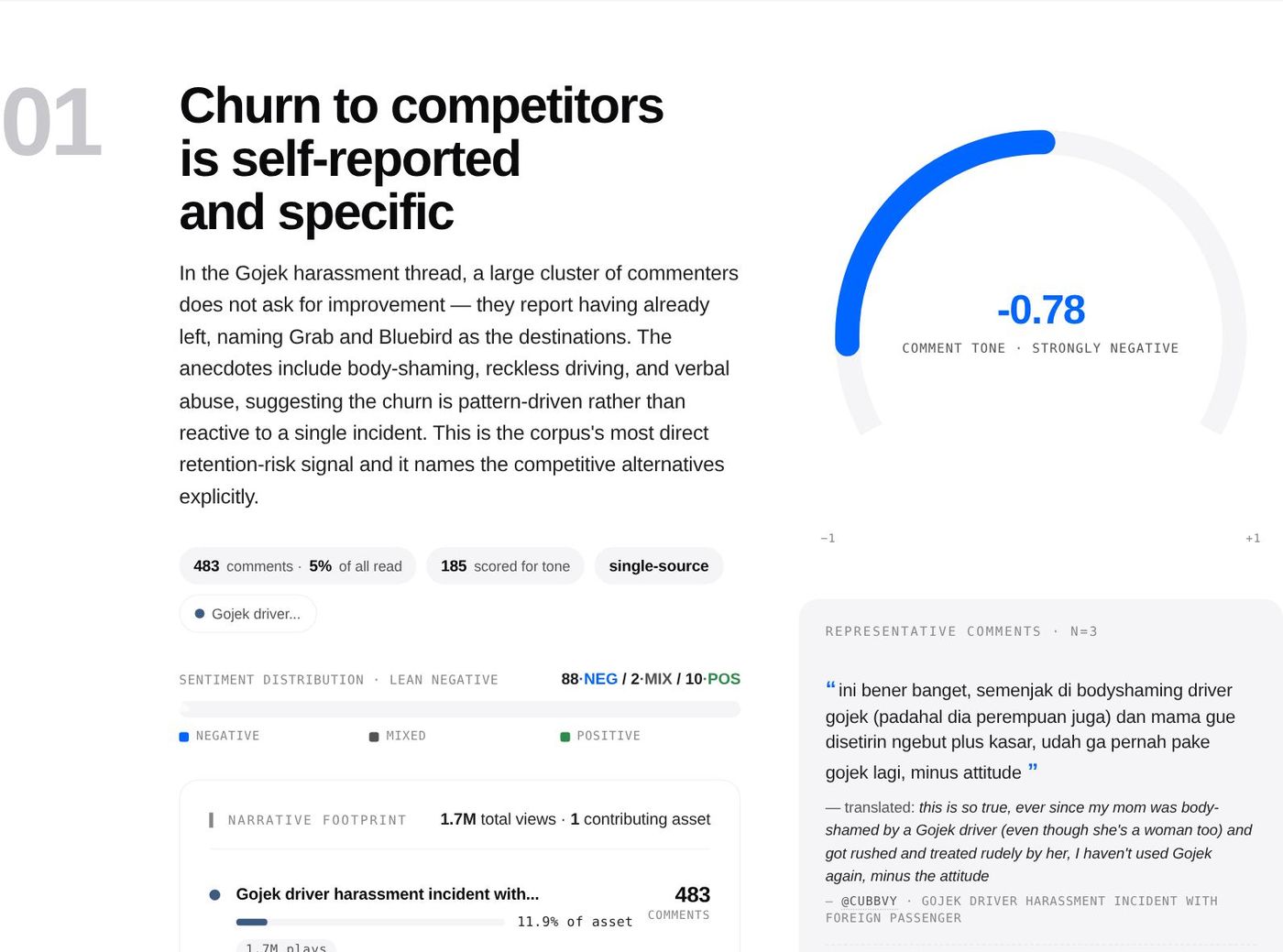
Seven narratives, ranked by how many comments carry them. This is the first.
- aWritten as a finding: people aren't asking Gojek to improve. They say they've already left, and they name Grab and Bluebird as where they went.
- bHow big it is: 483 comments carry it, counted across all 10,382.
- cThe proof: comments in the original Indonesian, each with a translation and who said it.
Each market, in its own voice
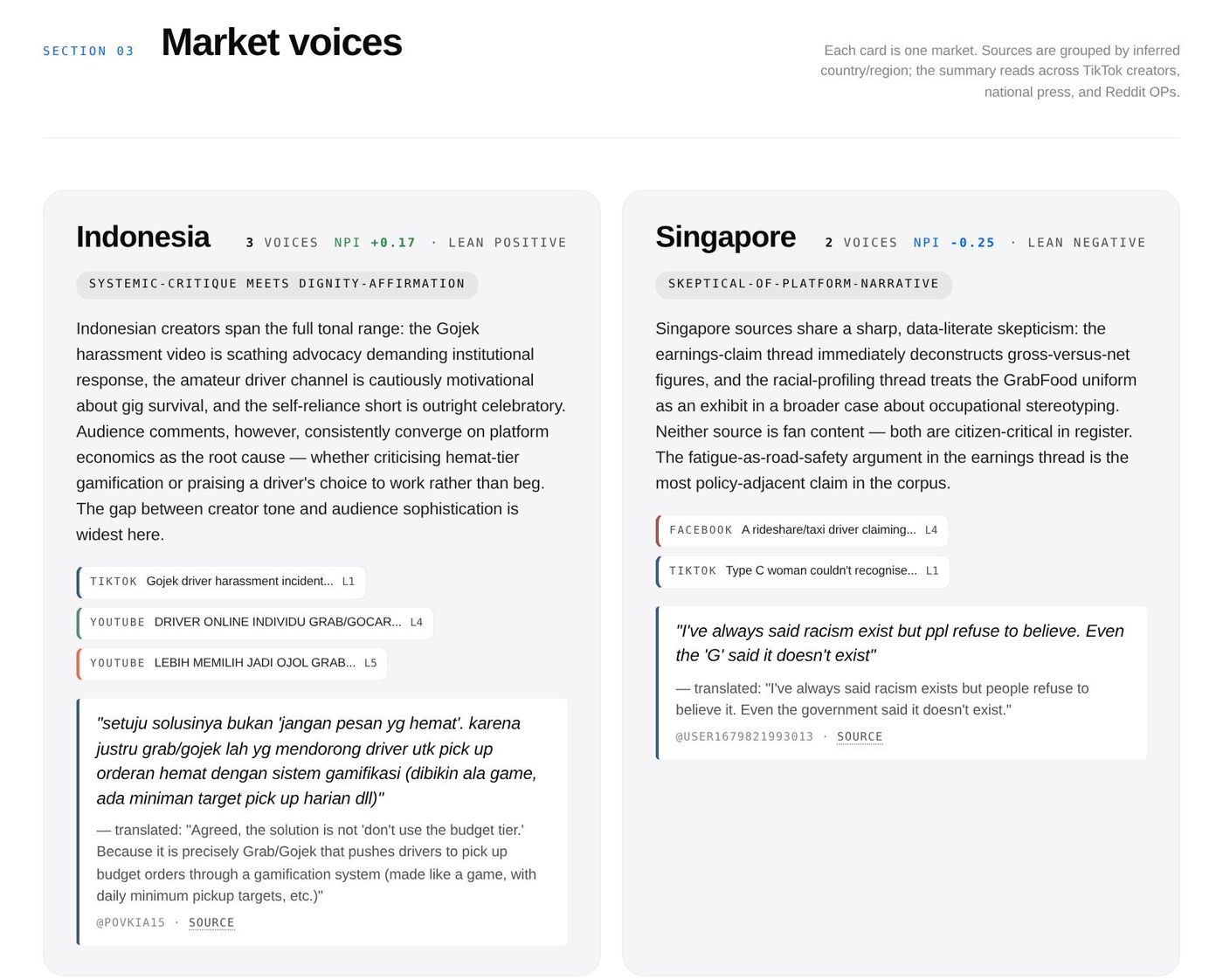
The same brand is having a different conversation in each country.
- aIndonesia leans positive about drivers and blames the platform's own design.
- bSingapore is sceptical: its commenters took apart a driver's $350-a-day earnings claim within hours.
- cEvery quote links to the comment itself, so anyone on your team can check it.
Now read the whole thing.
Seven narratives, three markets, the full source table and the methodology, exactly as delivered. The zip that comes with it adds a deep dive per source and every comment in a spreadsheet.